Saturday, November 29, 2008

Mad MS Paint Skillz

This past Monday we, as a class, visited the school's student art show. Unfortunatley, the pieces were already being taken home by their respective artists when we arrived. Cynthia, may I reccomend that next semester you take your class to see the show a bit sooner? Thanks. The art show was OK. I've walked through the small "gallery" quite a few times, so I'm familiar with the feeling of drowning in eight feet of art on all four sides. Its a small room, with a huge amount of...for lack of a better word, of art. As an art student, I appreciate the hard work that goes into every project, but while looking at all of these pieces, all I saw were...well, art projects. Not 'real' art. I know that the artists will be reading this, and this is directed at them: If saw you in person, I'd say this to your face: getting an "A" on your art project does not make it suitable for an art show. In stark contrast, the average museum has generally uncluttered rooms and art that is not made by students--so the art in museums and other galleries is usually of a much, much higher quality than seen here. Most of the "art" in this gallery falls into three categories: bad photoshop, bad painting/photography, and bowls. Three pieces in particular stood out to me, and while I'd give titles and artists if I could, I was not aware until after the gallery was closed and empty that we needed more than one piece. So I only have the title and artist of one piece--one of the few I thought was actually good. Also, Liz does not own a camera, so she instead drew pictures of the pieces from her memory using the wonderful medium of MS Paint. Liz will now stop writing in the first person.

Photobucket

This piece falls into the category of bad photoshop. I don't remember who made it, but I assume its When Punk Kids Have A Baby since those words were typed across the picture. One reason this falls into the bad photoshop category is that the techniques are too visible--the cigarette pasted onto the kid's lips has visible edges--but my main reasoning is that photoshop cannot 'fix' a poorly planned photograph. Perhaps I'm not hearing the entire story, maybe the class' assignment was to take a bad photo and make it better with photoshop, but gallery pieces are supposed to be self standing. You cannot expect that all of your audience knows the story behind the piece. This comment is for the artist, whomever they may be: keep practicing. There's a reason you're taking that class, and its to get better at computer arts and photoshop. I'm certian you're pieces will keep getting better, but this one is just not gallery quality. And I fail to see how a baby with blue hair, a tattoo, beer, and a cigarette is "punk". When I hear the word punk, I think of the Sex Pistols, not blue hair and dragon tattoos.

Photobucket

This is a bowl. There were many bowls in this gallery show. Sure, there were a few very cool sculptures, in particular one of some very odd looking fish, but there was an insane number of bowls, and that is what stuck in my mind. Bowls. I've worked with clay for a few years, and know that those bowls in the exhibit did not take a huge amount of skill. Spin some clay on a wheel, fire it, glaze it, fire it again, done. Looking at what are very obviously art projects presented as "art" in an exhibit makes me feel like the artists don't take their audience seriously. But the only people who go to art galleries are those who care about art. So how about caring for your art? I know that the artists could have tried harder, and if they don't want to, they can simply not enter their junk into art shows. If the artist doesn't take their work seriously, why should I?

Photobucket

This was possibly the coolest piece of art on display in the gallery this semester. A charcoal drawing of an ostrich, called Always Watching, drawn by Natalia Shishkina. This one stands out in the sea of gaudy photoshop and paint, the sea of bowls and so-so photographs as being a piece that someone actually put effort into. What really stood out to me when observing this drawing is how clean the details are. I know from experience that "clean" is not a word that is usually found in the same sentence as charcoal, but I'll say it: This charcoal drawing is incredibly clean. I applaud Shishkina for achieving this feat. I find this piece hilarious, too--that face is just priceless.

What this school needs is more artists like Natalia Shishkina, artists who, despite being students, understand what pieces belong in galleries, and which can be omitted. Of course, all artists have their really bad pieces, but they all make great pieces occasionally. And its only the great ones that I want to see in a gallery. I don't go to an art gallery to see some kid's photoshop experiment, or the very first bowl that some student made, I go to see real, evolved art.

Yeah, I know. I'm harsh. But that's life. I'm not going to lie and tell you you're stick figures are amazing, that's your Grandma's job. You're grown up now, and its the negative feedback that will really make you try harder to improve.

---------------------------

This is the final art blog that I'll be doing for this Art History class. It was a lot of fun, and I may start up a blog on my own. Its nice writing something that isn't in MLA or APA format. And instead of a works cited I just link to things, which is great. To all...five...of you who actually read this thing, thanks. Bye!

Saturday, November 22, 2008

Your Mom Can't Draw!

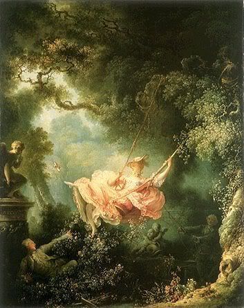
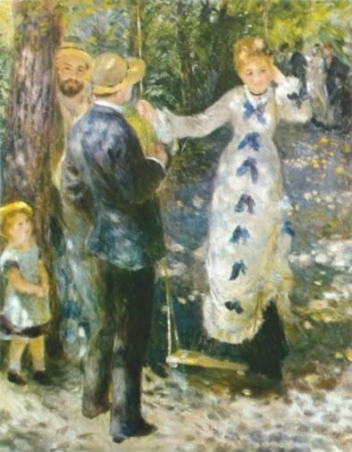
On Wednesday, we discussed Pierre-Auguste Renoir, and his many painting styles. At first a classical painter, he began moving more towards the impressionist style after years of creating great works like this, The Swing (1876).

Photobucket

However, all of this fuzzy painting over many years led the man to believe that he had lost his ability to draw correct figures and proportions. So after years of being an impressionist, Renoir decided to go back to being a classical painter...and failed. It was true, he had lost the ability to draw.

But we talked about all of that in class. So where's my contribution? Well, I've had a similar experience that Renoir had. Back when I was in high school, about Sophomore year or so, I thought I was amazing at drawing. Of course, all I drew were little cartoon cats, but I believed that I couldn't possibly get any better. I decided to take a cartooning/animation class just to prove I could draw better than everyone else, but was shocked when the teacher wanted me to use a different technique than the one I had developed over the years. Over the course of the next year I drew only in the teacher's preferred technique, and when the class finished I decided to go back to my own style...and I felt that I could no longer draw, I could only draw the way I had been taught. Every time since when I have tried to draw with my old technique the drawings look horrible, but I know now that they always were horrible and I am very thankful for the class I took( it taught me to draw using basic shapes as a base). In my silly high-school-girl mind back then, I felt similar to Renoir in that changing my style had permanently damaged my ability to draw. But I moved past that, and have found that experimenting with different styles and techniques has made me a better artist and has helped me develop my own style. Perhaps Renoir never got past the mental block of "I can't draw." Or maybe it was his arthritis.

---------------------------------------------

...It was probably the arthritis, huh. But the "mental block" theory goes much better with my story, so I'm using that instead. So there.

Saturday, November 15, 2008

Rikki Tikki Waterlily!

Today when you hear the name "Monet", the first thing that pops into your mind is probably, "Oh he did those waterlilies, right? I have stationery of that!" or something similar.

Photobucket

But that classic waterlily painting that you see when you hear Claude Monet's name wasn't always considered great art (by the way, Monet did a series of paintings of those waterlilies--250 paintings total). Back in his day, the late 1800s and early 1900s, paintings like his were considered incomplete and sloppy, and were called Impressionist. That's not a complement. Impressionism + Art in 1800s France = Bad Art. But these impressionists liked being different, those rebels. And they remind me of some artists today. Artists like...Chuck Jones and Charles Schultz.Cartoonists and animators.

Photobucket

As an animation student myself, I am well aware that there are many people who like comics, or think animated movies are "cool", but if asked they usually don't consider comic books and animations art. Just entertainment. Most believe that art is something you see in a museum, and nothing more. It is rare to find a person who believes that art can be functional, or something that you can see in a newspaper or on TV. Which is really...stupid, for lack of a better word. The average animated film from Pixar takes at least two years to make, and its not because the animators are lazy, but because its hard work. A cartoonist pours their life into their work, just like a painter or a sculptor, and they shouldn't be denied their title of Artist just because their art happens to be stylized and gestural. The Impressionists of France at Monet's time had this same problem. They did not make very much money while alive, because no one bought their paintings, and no one bought their paintings because the Salons of France didn't want sloppy paintings, they wanted "real" art. But the Impressionists did their own thing, and kept on breaking the rules--and look where that hard work got them. These days, Monet's paintings are considered art, and museums all over the world have some of his waterlily paintings on display. Perhaps one day the cartoonists and animators will get their work displayed in art museums around the world with the "Classic" paintings, and they will be considered artists too.

-------------------------------------

What actually inspired me to compare the Impressionists to today's cartoonists and animators was going to my school's art show and seeing that it was all paintings, photographs, and ceramic bowls. Art projects. And what annoyed me was that, well, most of them were not very good. And I thought, "If they'd post comic books in the art show, it would be more interesting," of course...I also believed that I would totally own that art show if they exhibited comics. Just wait. When the spring show is accepting pieces...I'll be ready.

Saturday, November 8, 2008

Lifestyles of the Rich and Unemployed!

I'm back again! Smiley face!

-------------------------------------


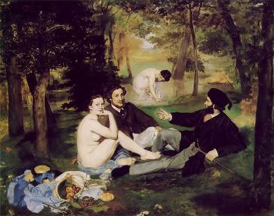
When you're hurt, and can't work, you call AFLAC. So when you're rich and don't work, what do you do? Well, you could swim around in your money, a la Scrooge McDuck, or you can actually do something productive like a man named Manet. Not Monet. That's someone else. I'm talking Édouard Manet (note that I successfully got that "e" with a little line on top), the man that was so rich (due to his family, of course) that instead of going to law school or getting an actually productive job, he decided to paint. And, being a man that didn't need money, he didn't have to follow the rules of the Academy of Fine Arts (Académie des Beaux-Arts)--which you had to do if you wanted to make a living off of your art--so he just did his 'own thing'. Which resulted in pieces like this one, Luncheon on the Grass (Le déjeuner sur l'herbe, 1863).

Photobucket

If you're looking at this and thinking, "This looks like a painting to me," you're right. It is a painting. But If you failed to notice...there's kind of a naked woman right in the middle of the painting. That's why the Academy didn't want it. Sure, they have tons of paintings of naked women in their Salon. But this isn't a foreigner or a Goddess. She's very much French. And that's bad. But remember, Manet had lots and lots of money. So he doesn't need people to like it. All that matters to him is that he likes it. You know who else has so much money that they don't need a real job? Here's a hint:

Photobucket

Still don't have it? Here's another hint: Her name starts with Paris and ends in Hilton. Paris Hilton has been filthy rich since she was born, and, like Manet, has decided to use her free time to explore the arts. She's tried acting, and was in House of Wax, in which she played some blond bimbo, a role which she has been preparing for for 24 years. Deciding that that wasn't enough, she even decided to record an album. It wasn't very good. But does that matter? Of course not! Paris doesn't do all this for money! She does it because she doesn't have a real job! Just like Manet, Paris Hilton is a rich kid who devotes her time to the arts...only Manet was actually good at what he did. While acting, singing, dancing, and modeling are things she sucks at, she is good at one thing: screaming. She even won an award for that. But if screaming isn't something that Paris wants to do, perhaps she should try her hand at painting. It worked for Manet.

----------------------------------------

I'm so mean...

Saturday, October 18, 2008

Do you Remember? (the 21st Night of September)

[Undirected Blog Five!]

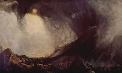
Time travel time! Lets go way back to the early 1800s. In this time period, the Romantic painters loved nature. A lot. Many of the landscape paintings of this time, part of a movement called--brace yourself--Romantic Landscape Painting (shock!), tried to emphasize the beautiful power that nature holds. One painter from this movement was a Joseph Mallord William Turner--a man accepted into the Royal Academy of Art at the age of 14. He placed humans into his landscapes, showing the awesome power of nature, and how no matter how hard we try, humans will always be at the mercy of the weather. Take Turner's Hannibal Crossing the Alps.

Photobucket

Here he places an army in the midst of a snowstorm, with the figures so small that you probably can't even see them in this picture. They're at the bottom, if that helps any.

Turner's painting seems to emphasize a need for humans to respect nature, and to be aware that the forces of nature can be much more destructive than expected. Remember hurricane Katrina? No matter how hard you try to build a town that will survive storms and flooding, you'll fail because your town is below sea level and the hurricane just so happens to have survived the sandbars. This disaster couldn't have been stopped, as I hear its pretty much impossible to destroy a hurricane, though it could have become less of a mess if the city of New Orleans wasn't built in that place at all. What this modern world needs now is people who respect fearsome nature, and understand that we cannot outsmart nature. Perhaps this current 'green' movement is the beginnings of a new Romantic Landscape Painting mentality in our populace. Minus the paintings of storms killing soldiers, of course. That's just Unpatriotic.

-----------------------
I almost went on a rant tonight about how stupid it is to build a city below sea level in hurricane territory! Good thing I avoided that. I think this week's Connection to Today segment was pretty strong! So I'm just going to go celebrate that achievement. See you next week!

Saturday, October 11, 2008

Angie's Lips, Please

[Undirected Blog Four!]

You'll notice I skipped a week. That's because we didn't have any lectures or reading last week. Moving on with my life...


Walking into the lecture this Wednesday, I expected to see the same paintings as the past few weeks--with perfectly painted figures. Imagine my shock when I saw this!

Photobucket

I was horrified. It just looks so...wrong. This painting, Odalesque by Jean-Auguste-Dominique Ingres (1814), was well-painted, sure, but only in the craftsmanship. The figure of the woman shown is just so stretched and distorted that I can't focus on the quality of the piece at all. Think I'm being melodramatic? Perhaps I am. But look at that back leg! It doesn't even look like it belongs to the woman at all. That topic was brought up in class, and then I learned how Ingres painted. He'd paint multiple legs and arms, then pick the best to paint into the final work. Which perfectly explains why his work looks so strange. No one person is perfect, and taking different parts from different people that seem perfect separately (the perfect nose, the best chin, etc.) creates some very strange results.

I was going to compare Ingres' painting style to the creation of Frankenstein's monster, but Mary Shelley published that story (Read it!) in 1818, so its a bit too old for my 'Connection to Today' segment. Instead, I've decided to compare his style to a fad in our decade--plastic surgery! Today's plastic surgeons are like modern day Frankensteins. A customer walks in and points to a picture of Angelina Jolie and says, "I want those lips!", and the doctor does some cutting and pasting (not literally--that would suck.) and tada! The customer now has Angelina Jolie's ridiculously huge lips! Of course, the lips probably won't match that person's face at all, and everyone that sees her will sense something odd about how her face looks. Its the same with Michael Jackson and his nose. And skin color. He looked fine when he had his own parts, but when they were changed, he turned into a monster.

Photobucket

Okay, so comparing Ingres' painting Odalesque to Michael Jackson is a bit extreme. Ingres only mixed arms and legs, and was amazing at rendering faces. In fact, his greatest works were small pencil sketches he did of tourists while living in Rome--he seemed to have trouble when it came to painting figures. But hopefully you understand the point I'm trying to make here. Mixing parts of people together to try and create the 'perfect' figure doesn't always work out, and always looks strange. Some cases more than others.

--------------------------------

I am so, so sorry for posting a picture of him. Feel free to bleach your eyes now.

Saturday, September 27, 2008

The Reign In Spain Stays Mainly in the Brain

[Or Undirected Blog 3, for those who are keeping track]

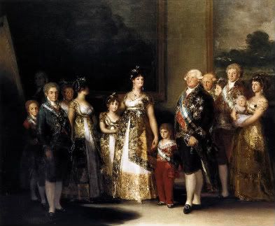
Romanticism in Spain! That's what captured my interest in the lectures this week. In particular, I found a painting by Francisco Goya, Family of Charles IV, the...for lack of a better word, funniest of the works shown.

Photobucket


This painting makes fun of the royal family that ruled Spain at the time. Showing a vain and bewildered Charles IV--who looks like a slightly...fuller version of George Washington--and his equally distracted family, Goya didn't try to make them look attractive, or place their heads on the bodies of athletes. The members of the family aren't posed either, with most of the women looking away and one whose face isn't even visible. Goya also placed himself in the painting, behind all the others in the top left hand corner. He separates himself from the useless royals by fading into the darkness in the back. And what did Charles and family do when presented with this painting? They hung it up in their hallway.

Leaders seem to have a habit of hiring the wrong people to present them to the public. Example: George W. Bush. White House Correspondents Dinner. 2006.


Bush hired Stephen Colbert to make a speech at the annual event, probably expecting a performance similar to that of Dana Carvey when former president Bush hired him years earlier. But Bush underestimated Colbert, and got a roast that made a bit too much fun of him, or at least more than Bush expected. Through the speech, the president is clearly annoyed at the comedian, most noticeably when Colbert tells him to "pay no attention to the people who say the glass is half empty, because 32% means it's 2/3 empty"(when speaking of the president's low approval rating). But honestly, when you hire a comedian who ridicules you on a daily basis, you should expect the worst.

So, in a way, the family of Charles IV in Spain and the current president of the United States have at least one thing in common: they're not very good at choosing those who paint their portraits. Whether on canvas with oil or at a podium with words, these portraits are amusing to the audience, but less so to the subjects themselves. I say they got what they paid for.

------------------------------

Did this make any more sense than last time? I think this connection was more...understandable than previous ones I've made. If it isn't, than...darn. There's always next week.

Saturday, September 20, 2008

That Darn Prostitute!

[Also Known As Undirected Blog Two]

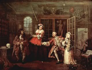
This week ( I believe on Monday) we discussed the French Sensiliet and English Sensibility movements of the 1700s. While looking through the images from these movements, the works of one particular painter stood out to me: William Hogarth. In class we were shown The Marriage Contract, one in a series of six paintings by the man. I found his work interesting, as it seemed a satire of the other paintings of this period--and I was somewhat correct. Apparently, this man was one of many who believed in marriage for love, and that a marriage without love was doomed to fail. To show his beliefs to the public, he created a series of paintings called Marriage a la Mode, which follows the doomed marriage of a poor aristocrat to a girl equally lacking. Their marriage, created for the purpose of benefiting their families, is loveless. To sum up the entire story, man marries woman, both cheat on each other, man finds out, kills woman's lover, man is hanged for murder, and woman commits suicide. Happy ending! Not. I love Hogarth's storytelling and his sense of humor when displaying to his audience the truth all around them.


My favorite painting in this series is not one shown in class, but the third painting in the series, called The Inspection(above) wherein the husband of the story goes to the doctor to complain about his syphilis medicine not working. At his side is a prostitute, who also has syphilis (As this man has had syphilis throughout the entire story, I believe that she caught the STD from him). I enjoy this painting because of the exaggerated expressions of the characters in the scene, as they remind me of comics in modern day times. In fact, this series is a sort of comic, as it can be viewed as sequential art. Maybe that's why I like it so much.

Which then brings me to my Modern Day Connection (capitalized because of importance) of the week! This series of paintings reminds me of...this blog by Bill Maher! Its short and more than a year old, but still reminds me of the paintings. As I see it, both of these artists ( I consider writing and comedy arts) have their own reasons for why arranged marriages are, maybe, not a very good idea. Hogarth believed that if you married someone you don't love everyone will end up dying in the end (like Hamlet but more people and one less war), and Maher sees arranged marriage as leading to Terrorism in some cases. Come to think of it, both artists claim that arranged marriage leads to death. Perhaps humanity will be forever torn on the subject of arranged marriages: they're good for the economy and the social status of your family, but they really, really shorten your lifespan.

-----------------------------

That said, I'm done for this week. I have also consistently misspelled marriage in this post. Anyway, until next week, beware of stray marriages! They're deadly!

Saturday, September 13, 2008

Tarzan: The Later Years

[aka Undirected Blog One]

Photobucket

After seeing The Swing by Jean-Honore Fragonard (above) for the first time during Wednesday's lecture, and failing to see both the swing and the woman that are the focal point of the painting, I googled it. When that same painting came up on my computer screen, I instantly saw both woman and swing. Staring at this, I wondered how I could have possibly mistaken this woman in her frilly dress for a bearded, white haired Tarzan figure. I'll blame this on the projected image seen at school, and move on.

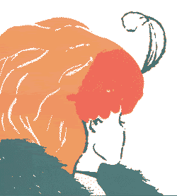
According to Cynthia, this painting is 18th century Pornography. Failing to see how this ordinary scene of a man waving his hat at a swinging aged Tarzan (later revealed to be a young woman) could possibly be considered pornography, I was reminded of those optical illusions which change their subject matter depending on how you focus your eyes (and sometimes mind), like the old woman/young woman image (below).
Photobucket
Look at it one way, and its an older woman with an unusually large nose. Glance at it again, and the picture's changed to show a young lady in a large hat looking away. Perhaps Fragonard's intention when creating The Swing was to make pornography with a twist: viewed one way its a romance between a young woman and her mysterious lover; in another glance it seems to show Tarzan's never ending love for the jungle.

---------------------------------------------

I realize that my connection of this painting to an optical illusion seems random, but in the strange workings of my mind these instantly clicked together. Maybe next time the connection between the past and present will make more sense (come to think of it, that optical illusion is pretty old...), or maybe not. Welcome to the mind of Liz.

Friday, September 5, 2008

Awesomesauce!

[Also known as Directed Blog One]

Five pieces of art that define me! Ready? Set? GO!!

NOTE: for these pieces of art, I pretty much just raided my photobucket account and folder of 'Stuff That's Awesome.' Which means that I don't have the names of artists for them...or any sources for that matter. If any pictures shown belong to you, please tell me so I can give you the credit you deserve!

1.

Photobucket

For those of you not familiar, this drawing takes characters from the Pokemon series of games and animation and places them in a scene from My Neighbor Totoro, an animated film. This piece embodies my love of combining different...things, for lack of a better word. Whether characters from one story exploring the land of another or a combination of all the sodas at a dispenser, I enjoy the unusual results that come as a result. I suppose this art is related to my love of postmodernism, as well. There's no 'high' or 'low', just art!

2.

Photobucket

Crazy carved crayons? Liz! These represent the 'crazy' in me...I'm random, colorful, and unique, just like this crazy set of crayons. I also believe that art is art no matter what media and what size...which again links to my postmodern beliefs. And every time I've typed the word 'crazy' in this paragraph, I've accidentally slipped a 'Y' between the a and z.

3.

Photobucket

[EDIT: You may (or may not) have noticed that this is a different picture than previously posted. The reason is that I finally found the picture I like best of hers, and HAD to slip it in. Also, the size fits much better into the blog...]
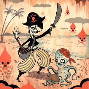
I actually have the name of the artist for this piece, Camille Rose Garcia! I was fortunate enough to have a school trip to see her exhibit when it came to the San Jose Museum of Art last fall, and I was stunned. Her combination of the morbid and cute is a great way to describe my own personality as well--I'm usually bright, happy and can be a bit of a goof, but I have a serious side as well. That seriousness is rarely seen when art is involved...

4.

Photobucket

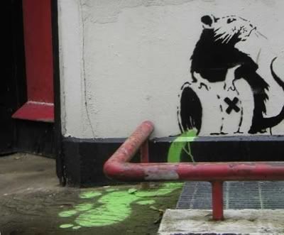
This is another artwork where I know the artist! Bansky! Simply put, the existence of this piece of graffiti in my list of art that describes me shows my view on the graffiti: art or vandalism conflict. I understand that graffiti is vandalism, but I still think of it as art. Illegal art, but art nonetheless. Should I describe how it describes aspects of my personality? Ok then...the rat pouring toxic waste in a sewer can be connected to my sense of humor and love for ridicule of the government. All good? Great. Moving on...

5.

Photobucket

This final piece, one I most definitely know the creator of, displays what I love and hate about my favorite form of art: comic books. This was drawn by the late Michael Turner, a man who drew women as something OTHER than breasts on legs--something that seems to be everywhere in comics today. I cannot stand seeing women portrayed as such, especially when its almost always men drawing them like that. What I also like about this piece is that he gives his women believable muscle mass, something that many comic artists have...issues with. If you haven't already guessed, my passion lies in comic books and animation, and I hope to work in the field one day. So this is the most important one of all, the piece of artwork that shows what I strive to be in every art class I take.

---------------------------------------

That said, I'm done! I hope that by completing this assignment I've helped my classmates (and anyone else who happens to be reading this) to better understand myself and my writing style. Because you're going to be hearing quite a bit more from me...